
A Mobile-Friendly Website is Critical for Your Business in 2025
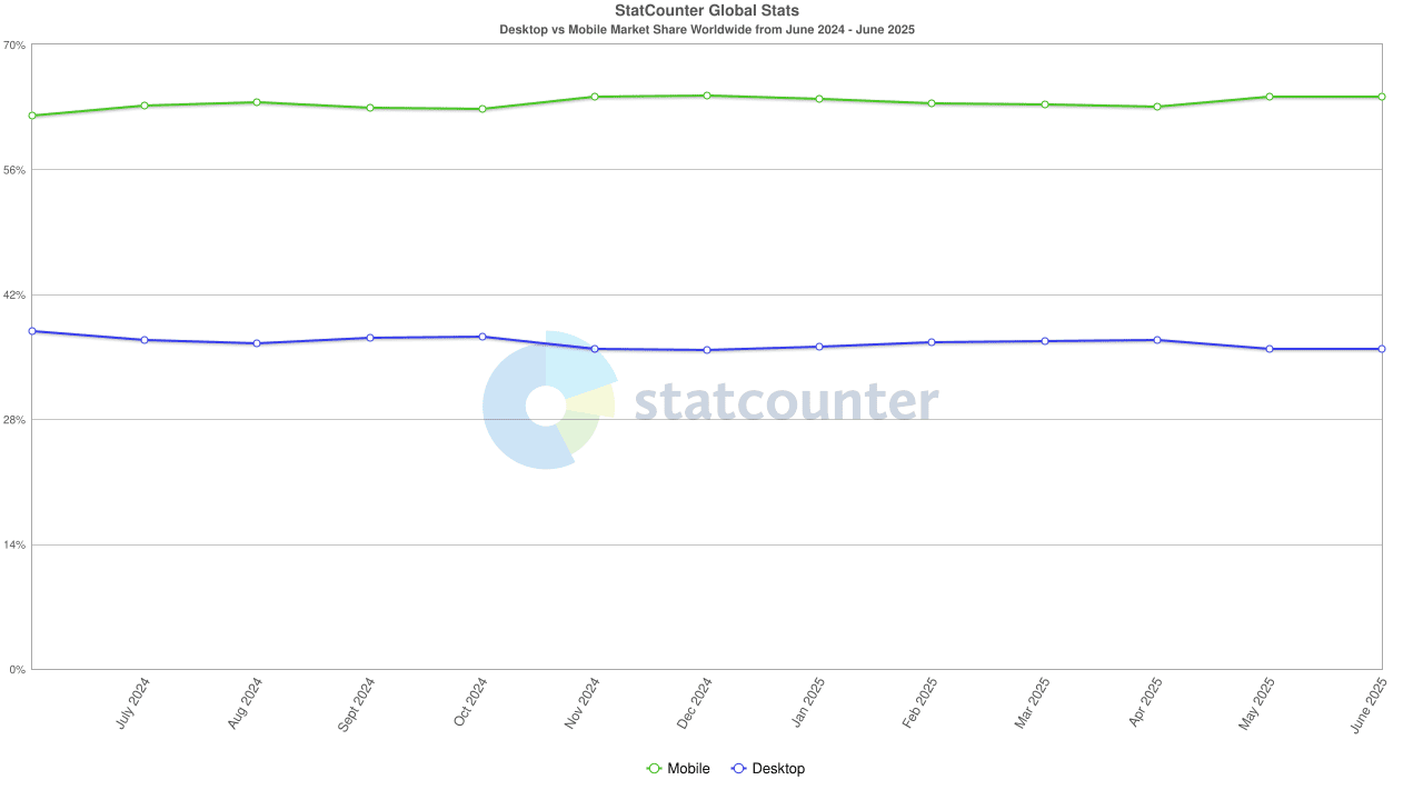
Mobile-Friendly website design has become a critical part of website design in recent years.The shift to mobile browsing isn’t new, but in 2025, it’s no longer optional; according to StatCounter Global Stats, in the past twelve months, mobile devices have grown to capture over 64 percent of the market share when compared to desktops’ 35% market share. Over 60% of all web traffic now comes from mobile devices. In the United States, the numbers almost break even with a near-dead heat in mobile vs. desktop traffic.
The Rise of Mobile: Where We Are in 2025
The growth of mobile use in daily life is impossible to ignore. All you have to do is step outside to see people on their mobile devices. Spend even a short amount of time observing people driving, walking, shopping, or almost any other activity, and you can’t escape the conclusion that nearly everyone is on their devices.
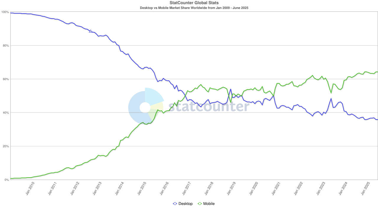
This shift from desktop to mobile usage took off starting at the end of 2016. In 2009, just under 100% of online browsing was done from a desktop computer. By the end of 2016, the mobile market share finally caught up and surpassed desktop browsing, and for the most part, desktop browsing has been on the decline while mobile browsing has continued to climb.
Consumers are increasingly utilizing social media for their online shopping. According to Global Banking and Finance Review, “More than 60% of users engage in shopping via social media, with a preference for visual-based product presentations, such as carousels and shoppable videos, enhancing the purchase experience.”.
Some of the key statistics from SimiCart show that the growth will likely continue to boom in the mobile e-commerce market:
- Mobile shopping has experienced a remarkable 20% growth from 2023, with an expected increase of $710 billion in 2025. This promising trend in the mobile e-commerce market presents a significant growth opportunity for businesses.
- More consumers are utilizing apps over websites for their online shopping.
It’s important to note that Gen Z is driving mobile-first expectations in the market, with Millennials showing a staggering 92% mobile usage rate for shopping. Understanding and adapting to these consumer behaviors is crucial for businesses to stay competitive.
Google Prioritizes Mobile Sites
Mobile-First Indexing
Google uses mobile-first indexing. In other words, Google uses the mobile version of a website to index and rank the site (Google). It has become imperative that website designers focus on mobile-friendly, responsive websites to ensure their websites rank well in Google results. If your website does not function well on mobile, it is going to hurt your website’s visibility in search engines.
Consequences of Non-Mobile Sites
A good website’s function is to attract visitors, clients, and sales. However, sites that are not mobile-friendly are at risk of ranking lower in search results, experiencing a reduction in organic traffic, and frustrating users. Businesses must avoid these potential risks by ensuring their website is mobile-friendly.
Google Core Web Vitals
- Mobile speed and usability are ranking factors
- Importance of responsive design and fast load times
Better User Experience = More Engagement
Websites need to be user-focused; put yourself in your visitors’ shoes. Start at the beginning and walk through the navigation and layout of the website. Is it easy to use? Does the layout and navigation make sense? Are there too many steps for your visitors to navigate to find the information they need or to take an action? Users do not stick around when visiting a slow, unoptimized site. If it takes too long to load, has a layout that is not mobile-friendly, or has too many steps to take, they will move on to a competitor’s site, and you lose a potential customer.
Important Website Design Considerations
- Navigation: Easy tap menus, no pinching or zooming
- Design: Clean, responsive design tailored for smaller screens
- Content: Readable text, optimized images, clear CTAs
- Accessibility: ADA-compliant features and performance
- Frictionless Interaction: Click-to-call, mobile-friendly forms, one-tap purchasing
- Local SEO & Mobile Intent: “Near me” searches are very common, and users on mobile are often ready to act immediately
How to Know if Your Site is Mobile-Friendly
DIY Tests
- Google’s Mobile-Friendly Test
- PageSpeed Insights
Key Elements to Look For
- Responsive design
- Touch-friendly navigation
- Fast load speeds
- Optimized fonts and images
Common Mistakes
- Desktop-first design
- Popups that don’t close
- Misaligned text/buttons
How to Make Your Website Mobile-Ready
Mobile-friendly websites are essential for SEO, UX, and customer engagement. Mobile-friendly is no longer optional; it is required for success. When building a website, these factors are key in making sure all of your time, effort, and funds are not wasted:
- Responsive Design Frameworks
- Working with a Web Developer or Agency
- Using WordPress or Other CMSs with Mobile Themes
- Ongoing Maintenance & Mobile Testing Tools
- Mobile UX Best Practices for 2025
Contact Studio 7 For your Website and Managed Hosting Needs
Is your website mobile-ready? Contact Studio 7 Website Design to find out how you can ensure your website works for you and your business. Request a free consultation today to start your website journey.